Pivot Tables in Excel. Through this post you will learn to create and configure dynamic tables with great ease, keep reading and find out the steps.
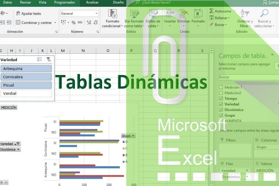
Pivot tables Excel.
To learn to do Boards Dynamics In Excel?
The style of Excel grids, with great ease allows to save and order a lot of information, this style is called "Database". Where a person can work with infinite possibilities to carry out numerical activities of any kind.
Many people do not know how to use the tools that Excel offers well, here in vidabytes.com We show you how even the "difficult pivot tables".
How do you easily create a pivot table in Excel?
To create it, we must first be clear about what it is: it works as an organizer of information in a summarized way without losing important details.
To do it, a series of grouped data must be collected, the logic is that it is not done in any way, since this process goes step by step.
To exemplify the concept that it is a Excel pivot table, You can build a tablet with the preparation and data of a primary school teacher during certain weeks.
The days he gave classes, the topics, the tasks he finally sent and of course the activities he carried out in the classroom will be detailed.
Knowing the pivot tables Excel
You have to assume that you can know separately from the tasks you submitted after two activities. As we can also deduce the moments in which the person invested greater lapses in the educational sessions.
To search for the aforementioned data, we must press any area of the table or spreadsheet. In the upper right side of the Excel panel, we must click on «Design» and «Summarize with the pivot table».
Immediately the program asks us a question: Where do you want to place that table ?; We click on "Accept", which continues with the generation of another Excel sheet.
Already in our new sheet, normally we will not see anything, but everything in white, as in the following example. It may seem complicated, however, it is extremely easy.
We must look for the key of the dynamic table, this is towards the bottom, on the right, exactly where it says "Filters, columns, rows and values".
Now at that moment, with the mouse we drag the fields that we observe in the upper part (those that say, day, topic, tasks and activities); this is to teach what we want to see in the table. Now we continue with a simple example. Which activity was the one that involved the most tasks?
In the upper area you can see the dynamic table that says "Activity" in the rows and the values of the "Task averages". In the area where the triangle is highlighted in with a red line, we press to choose the average.
When choosing it, we enter "Value Field Configuration". In this menu we can choose between sums, accounts, minimums, maximums or others. If you look to the left you will see the simplicity of the pivot table.
Creation of Excel Pivot Tables with various dimensions!
During the sample of the previous example we were able to see how to combine fields in the pivot table, to build the synthesis we need.
Only with a few steps we were able to perceive the average number of tasks of each of the activities carried out. To be clear about the day on which classes were taught, we only have to add the function "SEM Day".
In the examples given, the activity has been mobilized towards the columns so that it is easier to see, that is, less of these than days are observed. In the same way, time is chosen instead of tasks, since this teaches better information.
We must be aware that, to have an ordered pivot table, we must consider which is the best data to show, since some ways of combining our data can confuse us or not show a good summary. I don't understand my pivot table?
Understanding the pivot table
When carrying out the example, we observe that in yellow is the average of the minutes that the teacher invested in the class. In the green color, as in the yellow one, we can see the task data in order.
In gray, on the right side, you will see the daily averages combined with two specific activities. Finally, in blue you can see what the average minutes of the activities would be separately, but combining the days.
Each of the rows has precise information, by checking it several times and reading it, you will understand more easily what is shown in them. Best of all, other things about class patterns can be discovered from the entirety of this process.
Pivot tables are one of those tools that simplify work or order even at home, hobbies and others, some examples can be What customers are the most loyal? Which product has the highest profitability? Is my business seasonal?
These tables also work in other areas such as housework. Cleaning days? When should services be paid? Even to order large families.
All this can be deduced by creating an Excel table, where the data will be a structure that after collecting the information, will show us certain rows in which you will be able to inspect what is useful for your business, job and others.
Perhaps all jobs are different but the application of dynamic tables in them, adapted to the needs of each job, can improve on a large scale all these substantial benefits for a company to be able to function well, from a program as beneficial as Excel.
Are you a fan of computing and you want to be aware of the news? We kindly invite you to read Cloud Computing: Advantages and Disadvantages of that abstract and remote place that offers digital services through the Internet.